How to use Slicers in Excel (and why they’re better than filters)
")
Standard Excel filters have their place for specific workflows, but they become a headache when you need to explore data quickly. Instead of burying criteria in nested menus, you can use slicers to create an instant visual control panel.
Standard Excel drop-down filters slow you down
The hidden cost of the click
We’ve all done it. You click the little down arrow at the top of a column, uncheck “Select All,” scroll through a long list to find the few items you’re actually interested in, then click “OK.” It works, but it’s a clunky, menu-heavy way of interacting with data. The moment you click, your filtering choices disappear from view, leaving you guessing what’s currently applied unless you reopen the menu.
The problem gets worse when you start layering filters on multiple columns. Filter by country, then by department, then by product, and suddenly your spreadsheet is littered with little funnel icons that are easy to misinterpret.
That’s not to say that traditional drop-down filters don’t have their place. If you’re dealing with a column containing hundreds of unique entries, like specific part numbers or people’s names, the built-in search box is often the quickest way to enter a keyword and find exactly what you need. Traditional filters are best for this type of granular text search.
However, they have difficulty communicating their condition. Yes, they allow you to refine your data, but they don’t show at a glance what’s currently active. If you frequently switch between broad, high-level categories rather than searching for specific strings of text, hiding these choices in a menu makes your spreadsheets much harder to read, share, and audit, especially when multiple people are collaborating on the same sheet.
Slicers turn your spreadsheet into a visual dashboard
Better visibility for your data

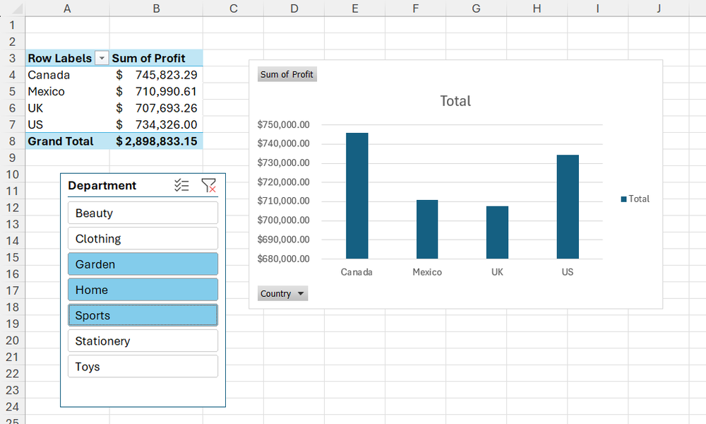
Slicers solve the biggest weakness of standard filters by opening up your options. Instead of hiding controls in drop-down menus, slicers turn your categories into large, clickable buttons placed directly on the worksheet.
Would you like to see sales in the United States? You just click on it. Do you want to include multiple departments? You can select multiple buttons at once by holding Ctrl when you click or click on the Multiple selection toggle at the top of the panel. Want to reset everything? A click clears the slicer selection.
This persistent layout turns your dataset into something closer to an interactive dashboard than a static grid. Another advantage is responsiveness. As soon as you click on an option, the data is updated. If a category has no matching records based on your current selections, its button is automatically grayed out. This feedback loop makes it much easier to slice up visual data without running into dead ends.
- Operating system
-
Windows, macOS, iPhone, iPad, Android
- Free trial
-
1 month
Microsoft 365 includes access to Office apps like Word, Excel, and PowerPoint on up to five devices, 1TB of OneDrive storage, and more.
You can use slicers on regular tables and pivot tables
Setting up your new workflow
One of the most common misconceptions about slicers is that they only work with complex pivot tables. Fortunately, this is no longer the case. Modern versions of Excel also support slicers on classic Excel tables, which means you can use them in everyday spreadsheets.
Here’s how to get started:
-
Click anywhere in your data and press Ctrl+T (or click Insert > Table).
-
Confirm your range and whether your data has headers.
-
Open it Table design tab, then select Insert Slicer.
-
Choose the fields you want to filter, then click ALL RIGHT.
Excel then generates floating panels that you can position anywhere on your worksheet. These panels are fully interactive: you can resize them, rearrange them, and use them to filter your dataset. I like to place them at the top so that they are front and center as soon as you open the spreadsheet.
The same concept applies to pivot tables (via the Pivot Table Analysis tab), where it becomes an effective tool for summarizing and aggregating data dynamically.

Connecting a single slicer to multiple datasets
One control panel for multiple views
Where Excel slicers really start to feel professional is when you link them to multiple pivot tables built from the same base data set.
To configure this:
-
Click anywhere in any of the pivot tables and in the Pivot Table Analysis tab, click Insert a slicer.
-
Select the field you want this slicer to control, and click ALL RIGHT.
-
Right-click slicerthen click Report Connections.
-
In the dialog box, check the boxes corresponding to each pivot table you want this slicer to control.
Repeat this process for all additional fields you want to control with their own slicers.
Dynamic charts transform your raw data into a vivid presentation
View your changes in real time
The app-like experience that slicers bring becomes even more evident when you add graphics to the mix. If you create a chart or pivot table from a slicer-connected table or pivot table, it updates automatically as the underlying data is filtered.
In most cases, you don’t need any additional configuration beyond creating the chart from a source connected to the slicer. When you select an option in your slicer, the underlying data is filtered and your connected charts are updated instantly.
By combining a few strategically placed graphics with clipping blocks, you can create a fully functional interactive presentation layer that completely replaces the need for static slideshows.
Your spreadsheets will finally look like a modern web application
Immediate productivity gain
Slicers are especially useful when you share your workbooks with others. Not everyone is comfortable with Excel’s traditional drop-down layout, and these visual buttons completely eliminate that learning curve. Instead of navigating menus, users interact with clear on-screen controls, making spreadsheets feel more like simple app-style interfaces.
They also improve clarity when exploring. Since all options are visible at once, anyone opening the file can instantly see the dimensions of the dataset. Since unavailable choices are grayed out based on selections, it’s easy to see how data points interact without constant trial and error. This makes slicers a great addition to dashboards, reporting files, and any spreadsheets that your team reuse over time.
A simple upgrade with a big gain
Slicers bring your data logic directly to the spreadsheet, where you can see and control it at a glance. Once you start using them, navigating your data stops feeling like a chore and starts feeling like interacting with a clean, interactive dashboard. When you’re ready to refine the layout, you can change the clipping styles to match your report design and create a beautifully polished finish.


